
Last edited on 18th June 2024
Whether you’re working in sprints, or just trying to get your projects wrapped up – one of the key skills of project management is dividing ‘effort’ into ‘time’ to ensure stuff gets finished on schedule.
And not just doing this at the beginning of a project and then forgetting about it: but responding to your projects as their progress inevitably ebbs and flows throughout its life cycle.
Of course, you can’t measure what you can’t see – and that’s where burndown charts come in.
What is a burndown chart?
A burndown chart is an agile tool that visualises how much work is left to do, and how much time there is to do it.
They can help manage resource allocation – and, indeed, help you to actually forecast deadlines.
It looks a little bit like this…
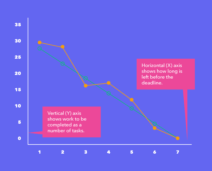
The X (horizontal) axis shows us how much time there is remaining, while the Y (vertical) axis shows us the remaining effort or work. (This is a numerical value which generally refers to the number of ‘tasks’ remaining on a project.)
The lines, as you can see in the key, represent ‘actual time remaining’ and ‘ideal time remaining.’ (Alternatively there might be an ‘ideal work remaining’ line and an ‘actual work remaining’ line.)
The ‘ideal time remaining’ burndown represents the perfect scenario where effort is distributed evenly across each day. It’s this line that’s often used to work out and forecast deadlines and is often a straight line.
But, as we all know – in the real world – that equal distribution isn’t how projects really work! This is why the ‘actual time remaining’ or ‘actual work’ line is often a bit more wobbly. Sometimes you’ll be ahead of schedule, sometimes you’ll slip behind, so the actual work line fluctuates along the way.
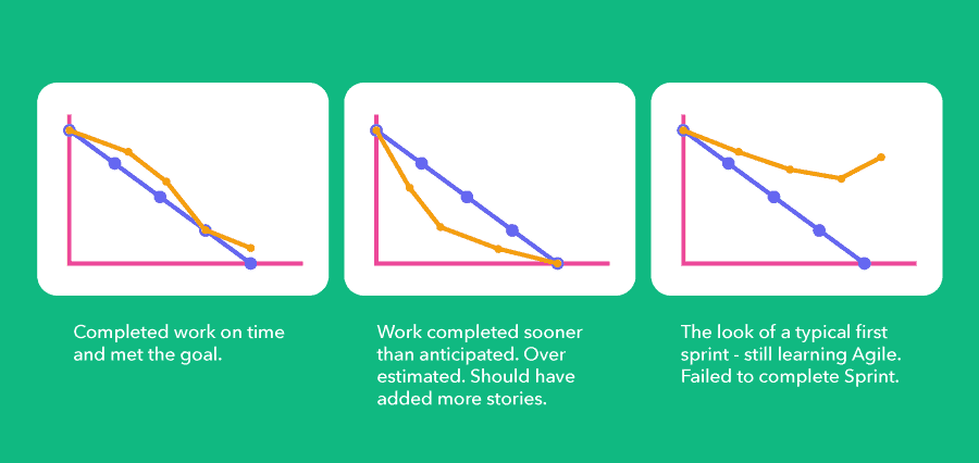
But being able to visualise this in this way will allow you to spot projects that are behind schedule, and move resources around to amp up production where required to ensure course is corrected.
The bullet points along the line are milestones and events as the project unfolds – these are often referred to as ‘story points’ in sprint burndown charts.
Why use burndown charts?
Using burndown charts gives you a series of key benefits:
– They help you visualise the status of projects at a glance.
– You gain the ability to respond to ‘lagging’ projects to avoid delays. (The burndown chart should be somewhere centrally accessible – many teams choose to display this physically in their office or on a data dashboard.)
Limitations of burndown charts
That all sounds great. But burndown charts aren’t without their problems and limitations.
They require regular updates
By their very nature, burndown charts need to be updated regularly – usually at least once a day – and this can create another bit of admin to keep updating, unless it’s synched with your PM tool in some way.
If the data isn’t up to date, the burndown chart becomes completely redundant as a yardstick for project progress.
They rely on good estimates and honest updates
Equally, we have a problem that’s inherent with any exercise in forecasting and reporting: is the data right?
How often have you worked on a project where, on paper, delivery within a certain timescale was more than achievable – but faced with the realities of other work, unexpected loss of resource or other circumstances beyond your control – you realise that it wasn’t quite as simple as you thought?
They lack nuance and detail
The simplicity of a burndown chart is both a strength and a weakness.
They’re great for getting a general overview of how many tasks are done and how many are outstanding – and that means they’ll work well where all tasks are roughly similar in scope and scale.
However, they don’t take into account the fact that Task ‘A’ and Task ‘B’, for example, might be wildly different in nature.
For example, if you were creating a YouTube video, your tasks might be:
– Record the raw footage
– Source the B-roll
– Edit the video
– Upload and promote it
Clearly, these will all take different amounts of time and effort, require different skills – but within the parameters of a burndown chart, all you’ll be able to see is whether they’re done or not.
This makes them potentially an unreliable data source for planning resource allocation.
They don’t take into account team capacity vs other projects
Another limitation is that they’ll only give you a view of *one* particular project at a time.
If you operate in a business where your teams are routinely working on multiple projects at any given time, you can’t plan resource allocation at a ‘team’ level using a burndown chart alone – because you wouldn’t know what else they had on their desk at any given time.
What about burnup charts?
Some people talk about ‘burnup charts’ rather than burndown.
These are essentially the same thing but ‘inverted’ so the lines work ‘up’ towards the total number of tasks that need to be completed.
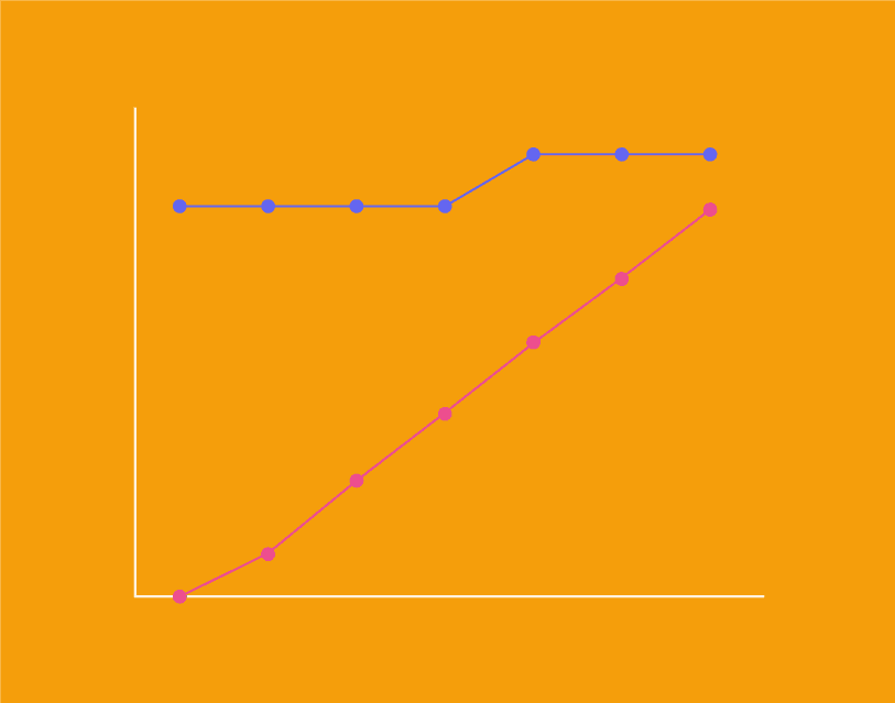
The difference here is purely notional – it’s the same thing but viewed from a different perspective.
Burnup charts encourage your people to ‘work up’ towards a number of completed tasks, rather than racing that downward, nosediving timeline in a burndown chart!
Final thoughts
To summarise, a burndown chart is an interesting way to measure overall project progression. By comparing your remaining work (or time) against the work (or time) you have planned for a project, a burndown chart shows how your actual progress is lining up with your plans.
Combining a burndown chart with a project management tool like Project.co is a great way to keep your team on the same page, giving everyone clear visibility of work completed as a project progresses.
If you do decide to use burndown charts, make sure to display them somewhere prominent where everyone has access to it, e.g. on a wall or whiteboard in your physical office, or in the ‘Embeds’ section of Project.co.
