
Last updated 19th April 2024
There’s an old adage that progress rarely happens in a straight line. And it’s particularly true in the complex world of project management.
While, in an ideal world, projects would come together like this…

…the reality is that this is pretty much never the case.
The idea of a project coming together immediately and experiencing flat, unbroken progress just doesn’t marry up with the way projects, teams and individuals work.
Actually, according to what’s called the ‘S-curve’ model, it’s more likely to look something like this…

What is an S-curve?
An S-curve is a mathematical graph – we project managers can use it to understand how a project changes and develops over time.
It tends to look like an S shape – which is where the name ‘S-curve’ comes from.
A mathematical graph?
Well, yeah – technically! Like a graph, S-curves have an X axis and a Y axis. In our example we’ve shown the X axis measuring time and the Y axis measuring project progress.
The Y axis on an S-curve might also be used to plan and monitor other, various project elements – things like cash flow, anticipated resource allocation vs. actual resources used, and more.
But the important thing to remember is that you’re planning the way a project should play out beforehand, to the way it actually does.
So why does it look like a letter ‘S?’
We could get super technical on this answer but, instead, let’s simplify. The core theory behind the S-curve is that there are different ‘phases’ to a project that play out and unfold in different ways: the start-up phase, the middle phase, and the end phase.
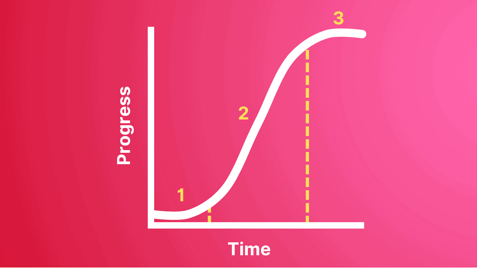
The start-up phase (1) is when a project is first started and, while there’s a lot of excitement and energy around it, actual progress is slow – since lots of that energy is tied up in planning and preparation (such as creating S-curve graphs!) rather than doing the project work. And, hey, this isn’t a negative – after all, fail to prepare, prepare to fail!
This is followed by the middle phase (2), which is when the project output really begins and it’s full steam ahead. Everyone’s firing on all cylinders and the bulk of the project deliverables and tasks are completed. This busy period is sometimes called the ‘inflection point’ in S-curve methodology.
Finally, there’s the end phase (3), when the project starts to mature and some of the initial enthusiasm starts to wear off. Or, to put it more bluntly – things are winding down and people are starting to lose interest!
This methodology doesn’t just apply to a project’s progress. For example, a similar logic often applies to project costs and cash flow – the bulk of the outgoings often tend to be bunched up in the middle phase in just the same way.
So how does the S-curve methodology work in practice?
Basically, the S-curve methodology in practice boils down to measuring ‘predicted’ vs. ‘actual.’ So although we’ve simplified it by showing you just one line, you’ll actually need two S’s on one graph. representing what you planned, and what actually happens.
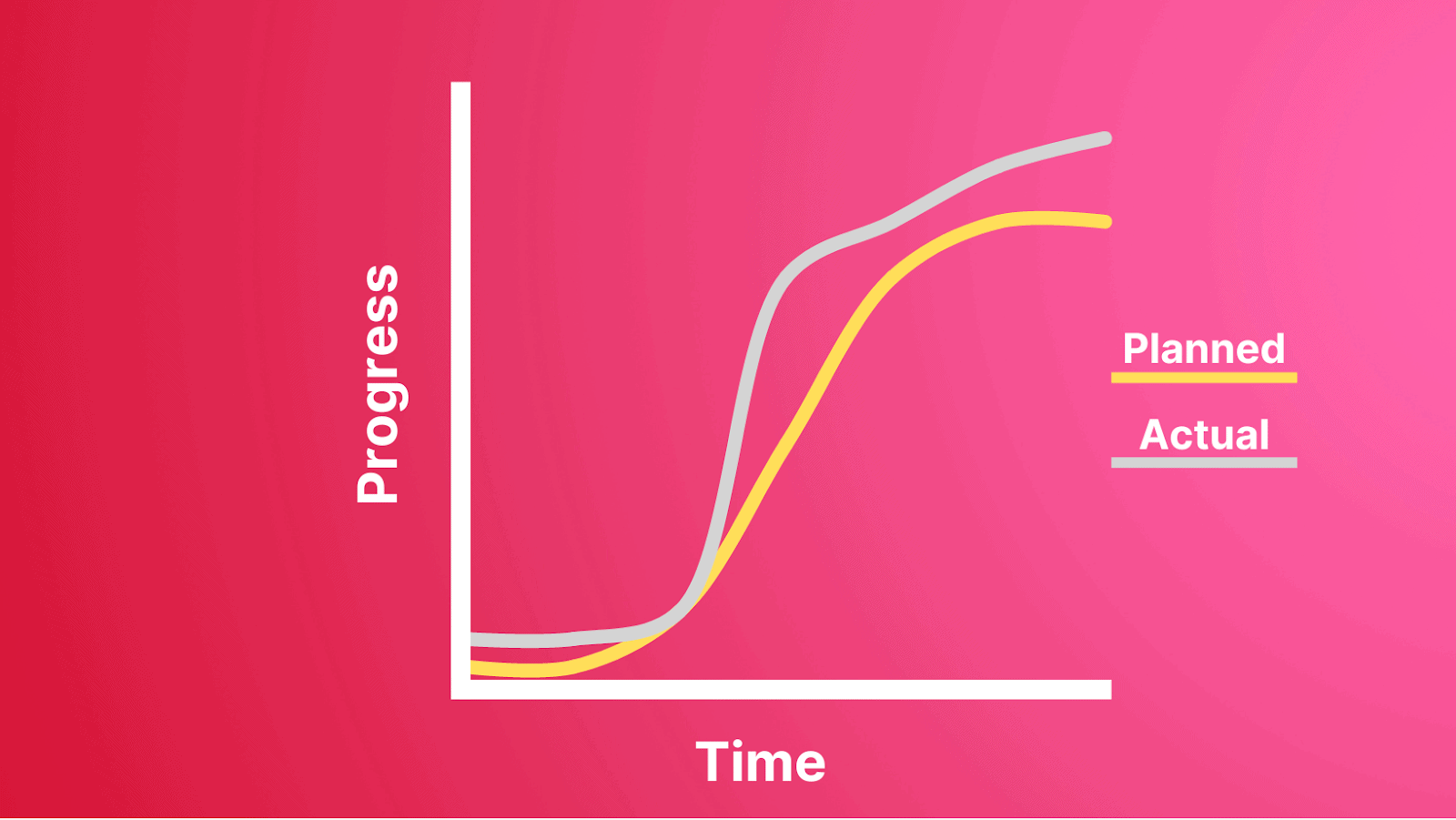
And their resemblance to each other will pretty much determine your success. You want them to look really alike.
In the early stages of planning a project, you create what’s called a baseline S-curve, or baseline schedule. At a simple level, this might forecast how many tasks need to be completed, man hours worked, or gadgets shipped, in how many days – taking into account the three different phases of project momentum/enthusiasm!
As the project progresses, real time cumulative data does its magical job, creating an actual S-curve or production schedule.
The objective becomes pretty simple – keep the two S’s as close as possible.
Having a clear idea of what needs to be done, and when, gives project managers a clear mechanism to spot potential delays and project roadblocks, intervene and allocate more resources. And this can be done throughout the whole project lifecycle, since it’s all forecast in one place.
The benefits of an S-curve graph
Improved communication
Using an S-curve in project management can help improve communication between team members. It’s pretty priceless to have a clear visual representation of where the project is at and what still needs to be done.
Better planning
It also allows for better planning and coordination of resources – as well as identifying potential risks early on. It also lets you play around with different inputs during the planning stage, so you can be better prepared for setbacks and pitfalls along the way and ‘game out’ your response.
Project budgeting and forecasting
As we’ve touched on briefly, an S-curve isn’t just for progress tracking – it can help with project budget and profit forecasting, too. The same S-curve methodology can be used to predict and then monitor things like cash flow and project cost which are equally critical components of project success.
In a nutshell…
It sounds complicated, but, to boil it down, an S-curve is nothing more than a simple and visual way to track project progress.
By creating a baseline S-curve and then using relevant cumulative data to monitor project progress (using a range of parameters) – you’ll have the best chance of success, within a realistic framework that recognises that progress does NOT and, sadly, never will happen in a perfectly straight line!
While you’re here – if you’re interested in project management and efficiency – why not give Project.co a try? We built our project management tool from the ground up to help teams and individuals give themselves the best possible chance of projects that thrive and succeed!
